ImageImage
benchmarking
Benchmarking
ImageImage

compare spending

Compare spending

The Benchmarking app allows a provider to compare on a DRG-adjusted basis his/her real-time spending per admission with their specific sub group, and highlights specific opportunities for improvement. A physician’s moving average is also provided.

The Benchmarking app allows a provider to compare on a DRG-adjusted basis his/her real-time spending per admission with their specific sub group, and highlights specific opportunities for improvement. A physician’s moving average is also provided.

How is my care risk adjusted?

IllumiCare creates cohort of patients based upon their final DRG.  This cohort methodology allows IllumiCare to compare the costs of patients within DRG groups such that the cohorts have similar acuity. Creating cohorts with homogeneous acuity and specialty provides a stable basis for comparing physician resource utilization.

How do I know what is good?

A provider’s overall percentile, when compared with their peers, is presented in a run chart graph widget. The area in green means that cost outcomes were above the median of the group, while red means that costs were below the median. The higher the percentile, the lower the overall costs.

Where does my variability come from?

IllumiCare details specific areas where a provider uses more resources than their peers in the incremental breakout of resource utilization.  Areas such as medication category, imaging modality and lab are all detailed to show overall incremental cost difference over the last two months.

ImageImage
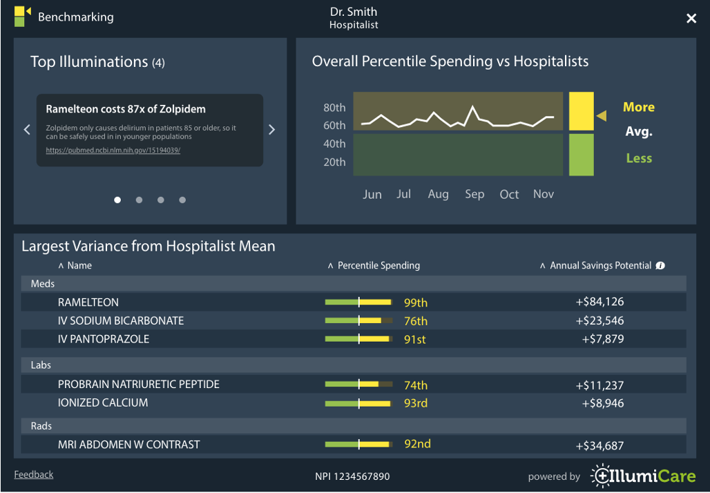
The provider can see at a glance, overall spending comparisons on meds, labs and radiology. The app highlights marginal cost items that are provider-controlled and about which they exercise judgment. The provider can drill down into specific medication and test spending variances (risk-adjusted) that separate them from their peers.

If you’re curious how Benchmarking might benefit your organization, let’s chat.  205.578.1738

Check out these other IllumiCare Apps
previous arrow
Slide
Slide
Slide
Slide
Slide
next arrow